


Introducing a series of blogs on CNT’s H+T Affordability Index – our most popular web tool.
Nearly 20 years ago, CNT (Center for Neighborhood Technology) developed our Housing & Transportation, or H+T, Affordability Index. We theorized – and the data quickly proved -- that adding the two highest household costs, housing, and transportation, changes the way we look at household affordability. In other words, examining how location efficiency drives true affordability.
The H+T Index is our most popular web tool with thousands of users annually. We thought it might be helpful for users and others concerned about housing affordability to delve into how the Index works, how people are using it, and what is in store for the tool in future.
This post, the first in the series, investigates what each element of the index means: Housing, Transportation, and Affordability. It also highlights what we plan to cover in our series.
Housing + Transportation Affordability Index History
First, a little history on where the idea came from. In 2005 the Brookings Institution called for proposals to develop ideas that would create more robust urban communities; CNT and the Center for Transit Oriented Development proposed developing an index that would demonstrate that the cost of transportation as well as housing should be included in housing and development choices. They helped fund the first iteration of the H+T Index. CNT used data from the 2000 US Census and odometer reading from the Chicago metropolitan area to construct a transportation cost model. This model incorporated housing costs and was tailored for 15 select metropolitan areas.
Working with the University of Minnesota, we concurrently developed a more detailed version for the Twin Cities. Both projects set CNT on a track of incremental improvement developing more sophisticated transportation models resulting in today’s H+T Index, which covers the entire US, metropolitan, micropolitan and rural areas alike. CNT tries to release an updated version of the index every two years or so contingent on available funding.
What Is Location Efficiency?
Like energy efficiency, location efficiency provides a lens for using resources in a smarter, more sustainable way. In location-efficient communities, going to work, shopping, getting kids to school and childcare, accessing entertainment and other social outings can all be accomplished in ways other than depending on driving a car.
Location efficient neighborhoods typically have good walkable and bikeable streets, access to transit, good proximity to jobs, mixed land uses, and concentrations of retail and services – in other words compact and vibrant places. In location-efficient places, households can justify paying more for housing because they can spend less on transportation to get to those daily tasks –perhaps even avoid owning a car altogether, a massive savings for most family budgets.
The fundamental insight of the H+T Index is that transportation and housing costs combined are a better indicator of household expenses than either measure alone. By combining them, it becomes clear that families with access to good transportation can more comfortably afford their home. The reverse is also true: a home in a far-flung suburb or rural area looks much more expensive after figuring in transportation costs.
The H+T Index shows how location efficiency is a better measure of household expenses than housing or transportation costs alone.
How we calculate Housing + Transportation
The household housing cost is extracted directly form the US Census American Community Survey (ACS). In contrast the transportation behavior and costs are modeled from various sources.
By adding the ratio of the housing and transportation cost to the household income to define the H+T Index, we changed how decision makers – from planners to lenders to homebuyers –think about allocating household resources.
Measuring “H”- Housing Cost as Share of Income
The “H” in H+T refers to housing cost or more specifically the ratio of housing cost to household income. We use the weighted average of home ownership, as measured by the ACS in the “selected monthly ownership costs” (SMOC) for owners with a mortgage and the “gross rent” (GR) for tenants paying cash (to avoid housing subsidies).
Since this is a measure of place and not households, the two measures are combined for every Census Block Group by taking the weighted average of SMOC and GR, weighting each by the fraction of owning households and renting households, respectively. Housing costs as a share of household budget have been well studied and well understood since before, we created the H+T Index. Transportation is a bit trickier.
Measuring “T” – transportation costs by household as share of income
There is no reliable measure of transportation cost at a local geographical level. To get at this figure, we developed a statistical model for estimating household auto ownership, auto use, and transit use and then applied a cost to each of these transportation components.
The transportation behavior is modeled using both neighborhood and household variables. The following infographic, from the H+T Index methods, describes the input variables that go into estimating the average household transportation behavior for a given place, and then each of these are assigned a cost to estimate the average household transportation cost. The various data sources including the ACS, the Longitudinal Employment Dynamics Data, CNT AllTransit database, and odometer reading from a large sample of household vehicles across Illinois, then the cost these transportation components is applied using regional gas prices, consumer expenditure data and the national transit database’s farebox revenue.
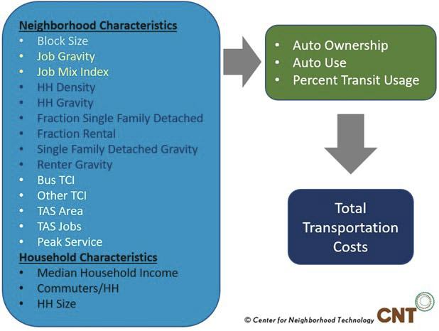
Once the transportation model has been calibrated, it is run for a standard household in each metropolitan/micropolitan area (or for a county in rural areas), using the typical household for the region (regional typical household), i.e., using the area median household income, the average household size, and the average number of commuters (workers who work outside of the home).
This allows us to make an “apples to apples” comparison of transportation costs by place, and thus the index is a measure of a location’s transportation affordability.
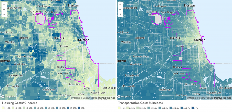
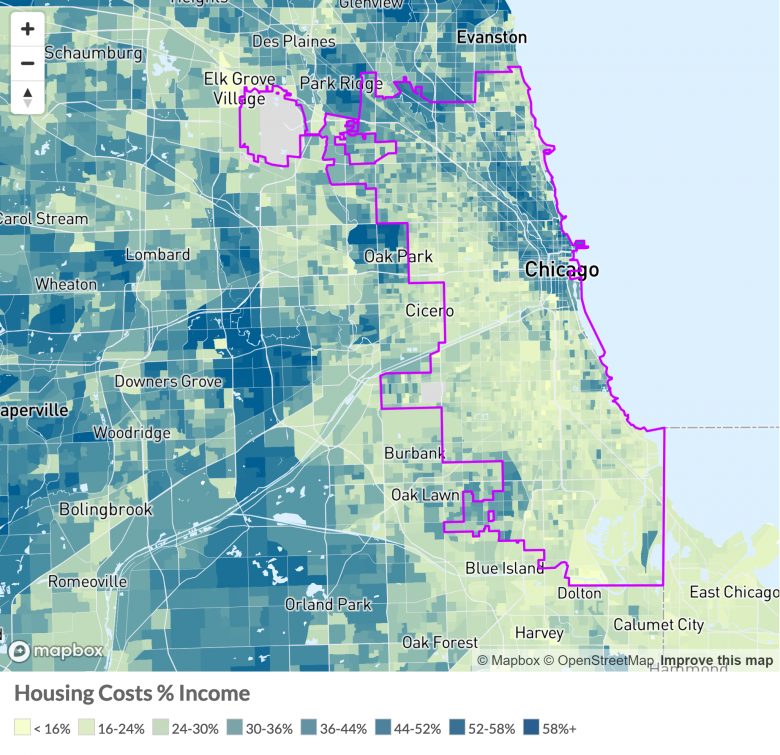
The following map, from the H+T Index web site, shows the ratio of the modeled transportation costs to the median household income for each Block Group in Cook County Illinois (with Chicago outlined).
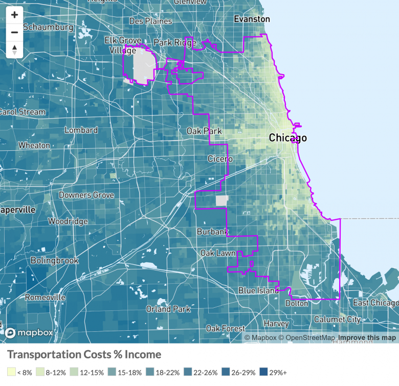
This map shows there are significant differences in the cost of transportation by location. We know from the American Consumer Expenditure Survey, that the average household in the US spends approximately 15% of their income on transportation. The lightest three colors indicate where the estimated transportation cost for the regional typical household is less than the national average of 15% of income spent on household transportation.
The “A” -- Affordability
Typically, the real estate industry considers housing costs affordable if it is less than 30% of the buyer’s income. Many landlords use the same ratio when considering new tenants. Combining this 30% rate with the 15% on transportation figure, CNT set a goal of H+T affordability at less than 45% for a place to be considered affordable for the regional typical household.
In the maps below the yellow and light green shades (first three color codes) represent an affordable place for the regional household, and the various shades of blue represent places that are considered not affordable.
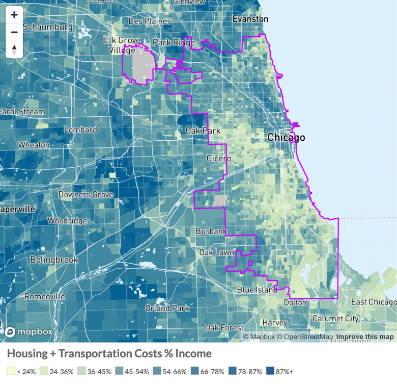
The two definitions of affordability give different results. By sliding back and forth on the map above shows where places are deemed affordable under the traditional criteria of 30% of household income is spent on housing, vs CNT’s definition of affordability criteria of less than 45% of income is spent on housing and transportation.
Example – how it looks on the ground.
The H+T Index highlights the advantages of building in compact neighborhoods near public transportation. This typically means denser urban communities. Here are some examples using H+T Index data for Chicago and Cook County:
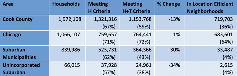
- Out of 1,066,107 households in Chicago, 759,657 households are in areas where housing costs 30% of household income or less, but slightly more, 764,441, are in areas that meet the H+T criteria.
- Out of 839,986 households in suburban Cook County, 523,731 households are in areas where housing costs 30% of household income or less, but far fewer, 364,366 households, are in areas that meet the H+T criteria.
Put another way: If we define a location efficient neighborhood as a place where the cost of “T” is less than 15% of household income, 64% of households in Chicago live in location efficient neighborhoods, whereas only 4% of households in suburban Cook County live in location efficient neighborhoods. Here is a more detailed summary of these numbers.
Summary
At CNT, we believe both households and regional planners should consider the H+T index when contemplating their next move. The next blog in the series will go into why we need to fix the household’s make up for the H+T Index.
Here are some of the subjects this series of blogs will cover in current and future posts:
- The H+T Index – an introduction and overview
- Why do we use the regional typical household?
- So, what else can I do with the H+T Index?
- A look under the hood of the transportation model
- H+T’s relevance and policy implications
- What did we learn from the results from our H+T User survey?
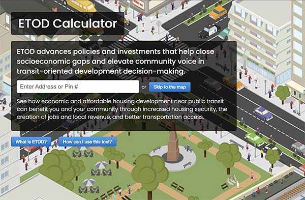
- Connecting H+T to ETOD (Equitable Transit Oriented Development)
- The future – equity and affordability
 RSS Feed