


The H+T® Affordability Index highlights location efficiency by using an “apples to apples” comparison of housing costs.
What’s the Question?
Users often ask why we use the median-income household in every block group in a metro area, pointing out that this misrepresents the actual costs for the households living there. The question goes to the heart of how our tool shows that living in compact and convenient area helps people stretch their budget.
In a nutshell, the H+T Index is a place-based index of household affordability. It focuses on the spatial components that drive affordability. Therefore, it is necessary to take out the variation in the local households; so, the calculation uses a “fixed-household” everywhere to make an “apples to apples” comparison of housing and transportation costs across the region.
The tradeoff of maintaining a constant household across all locations was a potential lack of equity measurement since there is variation in household income and costs. However, the payoff was that the Index could concentrate on the efficiency of good community development. Nationwide, the H+T Index consistently reveals residents can cut expenses when they live in more compact locations with easy access to necessities -- food and other shopping, for example -- and transit.
It’s not just about transit. Transportation costs drop when you live within walking distance of necessities (this is the root idea of the 15-minute city). While we recognize there are many different types of households living in these places, but we use the “fixed-household” to focus on location efficiency, by highlighting variability in costs driven by location.
In other words, people choose to live where they can afford to. Wealthier households can pay more to live in non-location-efficient neighborhoods, while those with less face limited choices. So the “local” affordability is not necessarily a good measure of location-efficient neighborhoods. That is why we use the “fixed-household” everywhere.
We dive a bit deeper into the details of how and why we chose to measure location efficiency the way we did in the rest of this post.
What Is Location Efficiency?
Like energy efficiency, location efficiency provides a lens for using resources in a smarter, more sustainable way. In location-efficient communities, going to work, shopping, getting kids to school and childcare, accessing entertainment and other social outings can all be accomplished in ways other than depending on driving a car. (read more about location efficiency in part one of the series)
The Fixed-Household
The fixed-household is one with fixed household income, household size and the number of commuters (people working outside the home). For the H+T Index tool there are three such households the user can choose:
- The regional typical household defined as:
- Household income fixed at the median household income for the metropolitan area for metropolitan area, the median household income for the micropolitan area for micropolitan area, median household income for the county for rural areas (AMI).
- Household size fixed at the average household size for the metropolitan area for metropolitan area, the average household size for the micropolitan area for micropolitan area, average household size for the county area for rural areas (typical HH size).
- Commuters per household fixed at the average commuters per household for the metropolitan area, the average commuters per household for the micropolitan area, average commuters per household for the county area for rural areas (typical commuter/HH).
- The regional moderate household defined as:
- Household income fixed at 80% AMI.
- Household size fixed at the typical HH size.
- The commuters per household fixed at the typical commuter/HH.
- The national typical household defined as:
- Household income fixed at the national median household income.
- Household size fixed at the national typical HH size.
- The commuters per household fixed at the national typical commuter/HH.
In this blog post we will use the regional typical household in the Chicago region (Annual Income = $71,770, Commuters = 1.24 workers, and Household Size = 2.66 people) to illustrate the concepts.
As a point of reference for the rest of this blog, the following two maps of the area around Cook County IL (with Chicago outlined) show one variable by Census Block Groups – the household income for the local-household and the regional typical household.
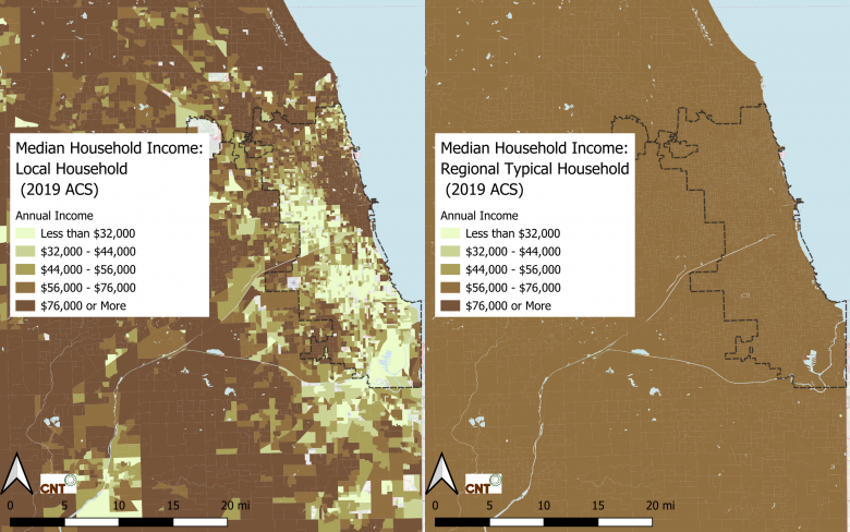
The first map, using the local-household, shows how income varies across the region, and the second map (which is kind of silly since it is the same everywhere – and that’s kind of the point) shows the imaginary regional typical household income across the region.
Housing Cost as a Share of Income Across the Region
The “H” in H+T refers to the ratio of housing cost to household income. Read more about how this is calculated in a previous blog. The following two maps show H by Census Block Groups for both the local household and the regional typical household.
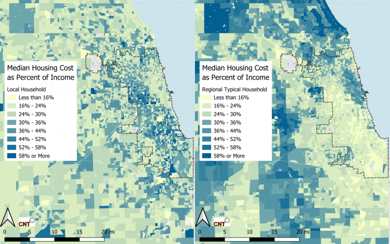
The first map, using the local-household, show that in general people live where they can afford the housing (H<30%), while the second map shows that there are neighborhoods where the typical household is priced out (those with darker colors) and some neighborhoods that are very affordable (those with lighter colors) for this imaginary household.
In other words, the first map shows that people live where they can afford to, and the second shows how housing costs are driven by the household income in the neighborhood. It is no surprise that wealthy people have the option to live where housing costs are high and low-income households’ choices are limited to neighborhoods where there is more affordable housing - and even then, this is often not meeting the typical standard of affordability of 30%. This is another important feature of the first map, it illustrates the fact that the housing burden is quite high in the neighborhood shaded dark blue; these heavily housing burdened areas will be explored in an upcoming blog post in this series.
Transportation Costs as a Share of Income Across the Region
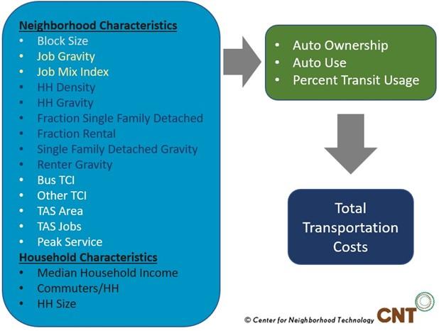
To illustrate the importance of using a fixed-household, consider the following two maps. The first showing the estimated transportation cost as a percent of income (the T part of the H+T) by Census Block Groups, for the local-household and the second showing the same for the regional typical household:
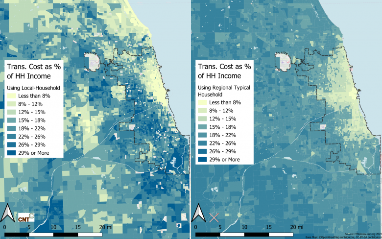
These two maps (when compared to the income map above) demonstrate quite clearly that the local-household income drives the T ratio for the first map and the second is driven by location efficiency. The “apples to apples” comparison in the second map highlights the location efficiency of the neighborhoods and the first map shows that transportation cost burden is not evenly distributed across the county.
Adding them Together
Finally, the following two maps show the sum of the estimated housing and transportation cost burden (H+T) modeled using the local-household by Census Block Groups, in the first map, and the fixed-household in the second:
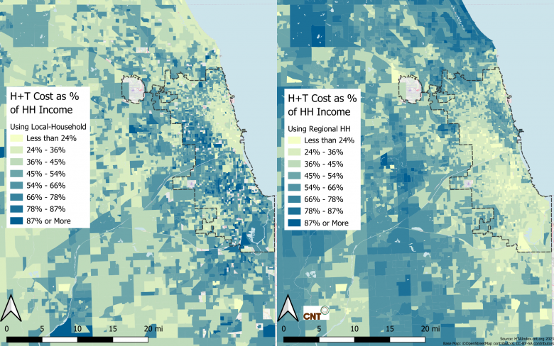
The map on the right (the H+T Index) is almost a mirror image of the one on the left. Another way to think about the H+T Index is that it shows the affordability for a typical household in the region, if that household were to live in any location. We use the second map on the H+T Index website, to keep the focus on location efficiency.
The first map, however, tells a different story (not displayed in the H+T Index) that the spatial distribution of housing and transportation burden is not equitably distributed across the region. In a future blog post we will explore how we might develop a new tool, using the first map, that will expose the inequity of housing and transportation access. And just like all the tools we develop at CNT, we want the community of users to then work on making this cost burden more equitable. But for now, the H+T Index, by making the spatial comparison, has been and still is exposing the concept of the affordability of place and the importance of location efficiency.
Summary
So, you can see that by modeling transportation costs across the country and using the same household to compare neighborhoods helps make the level of location efficiency more transparent.
Here are some of the subjects this series of blogs will cover in current and future posts:
- The H+T Index – an introduction and overview
- Why do we use the regional typical household?
- So, what else can I do with the H+T Index?
- A look under the hood of the transportation model
- H+T’s relevance and policy implications
- What did we learn from the results from our H+T User survey?
- Connecting H+T to ETOD (Equitable Transit Oriented Development)
- The future – equity and affordability
 RSS Feed